
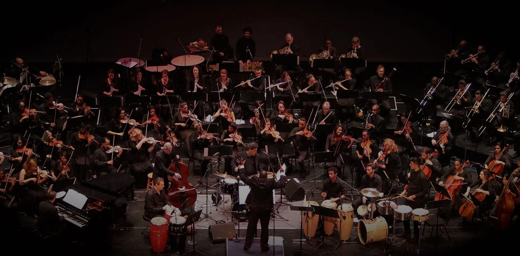
Client: Chicago Jazz Philharmonic ( CJP):
The Chicago Jazz Philharmonic sought to move to a new CMS platform and, along with it, improvements to their sites navigation, information architecture and frontend/backend usability. Their key focus was to make it easier for the internal team to efficiently make updates to special events, educational programing and concerts. The secondary focus aimed to highlight their more prominent programs and elevate branding to link
Along with UX consulting, I also developed (2) new website concepts aimed at emphasizing key programs and modernizing the branding that....

Discovering Opportunities
UX Audit
Performing a UX audit is about familiarizing myself with the site and how I interact with its basic functionalities and navigation. Its like going to the doctor for a routine check-up where the doctor checks vitals like heart rate, blood pressure, weight and breathing.
For this “check-up”, the “vitals i looked at are: basic navigation, functionality, typography, overall organization of information (information architecture) and the overall aesthetic. This process produced a foundational understanding of both the client and the clients content which is useful to help give myself a sense of direction. I also used the audit to look out for any pitfalls I may run into and take note of them to address later down the line.
R E S U L T S
Upon first glance, my eye went directly to the typography being used. It was inconsistent, the kerning was very compressed creating a very claustrophobic feel and resulted in the overlapping of highlighted text and even the letters themselves. Throughout the website, there were about 5 different fonts and varying degrees of spacing.
Second, there was tons of information being housed in this website; the history of CJP’s founders, the various types of educational programmings, leadership programs, musical residencies…etc. I found it to be very overwhelming and hard to navigate. Some pages were very deep and required a multitude of unnecessary clicks. Some information was contained in an image that was then uploaded to the site to act as a “block” of both text and images.
Conducting Interviews and Testing
The data gathered from a UX audit always requires more depth and backing to better inform any recommendations found during an audit. User interviews and usability test provided further depth and insight while also generating more evidence to support my recommendations. They widen my scope and allowed me to see first hand how users navigate the site and their thinking behind how they think the site should function. The interviewees also tend to provide great feedback that I may have not recognized during the initial audit.
When looking for participants, I wanted to get individuals from the various demographics to see how habits overlapped and differed based on their different needs, as well as, gain more diverse feedback. Luckily, I was able get a parent of a child attending CJP’s educational summer camp; a CJP instructor/musician and CJP’s event coordinator to participate in an interview and testing.
Usability Test
These test comprised of 3 simple tasks and guided users through flows that I found to be cumbersome and confusing. The test focused on these three tasks: (1) register for the educational summer program; (2) make a recurring donation aka join Jazzical Society; (3) purchasing tickets for an upcoming event.
R E S U L T S
Parent C
Parent C ran into some barriers during all three task but they struggled the most with the second. The first task (registering) was completed in under a minute and took 6 clicks when it could have only taken 3. This was due to conflicting information being posted regarding registration being “closed” or “open”… that caused a bit of confusion and resulted in the doubling of clicks required.
The second task (donation) required 1 click and should have been able to be completed in less than 30 seconds. They correctly accessed the form via the main navigation but quickly went back because they thought they were only making a one-time donation. That’s 2 clicks. They then clicked on the donation button on the main donation page but got confused again because it was the same as before leading them to believe it was the same one-time donation form. That’s 3 more clicks.
For the final flow, Parent C then clicked on the “Learn More” button on the main donation page leading them to another donation button they had to click, totaling 7 clicks and taking almost 2 minutes. Here, they realized that the form was the same for both recurring and one-time donations. Laughing it off, Parent C was relieved and was actually surprised they didn’t know about the Jazzical Society.
She sign-up on the spot!
The third task (purchasing) was done in 2 clicks in under a minute. The only pitfall Parent C had with this task was differentiating between past and current events. For example, events that just wrapped were still up and still allowed you to go through the flow of buying a ticket, but wouldn’t actually let you complete the purchase.
Instructor J
Due to Instructor J’s familiarity with the website, they did very well with all three task and completed them within the time and clicks allotted. However, they did have feedback for the topics of each task.
(1) Being one of the instructors for the summer program, Instructor J had much to say. They felt that everything was presented in a very haphazard and confusing way. They wished the information was more concise and the branding more consistent.
“There is no rhyme or reason to why things look they way they do. I wish there was more consistency. It’s a mess. Whenever I look at these pages, my eyes get overwhelmed.”
(2) The donation page looks and feels very unprofessional and a bit “scammy”. They were confused as to why there is no “Donate” button on the home page. They also thought the donation form could be better formatted.
(3) The main feedback Instructor J had was having that listing current and past event made it confusing to the audience, epsecially when the dates are also not clearly formatted and emphasized.
Event Coordinator P
Similar to Instructor J, Event Coordinator P navigated through the flows seamlessly. Their feedback centered around how things were organized in the backend and how they would like it to be.
(1) They were very frustrated with how they have to input and update content for all the educational programming. Due to how they built the website, they have to create an PDF with all the content and copy and upload it as a file onto the website. If they need to update said information or content, they need to go back to the original PDF, update it, and then reupload the PDF. They find this process very cumbersome
(2) They too are baffled by the lack of a donation button on the home page. They also think the donation page is very messy and doesn’t look good or official at all.
(3) Again, similar to the education pages, the Event Coordinator P wished there were a better way to set up buying tickets instead of creating an image or PDF that acts like a hyperlink the event management platform they are using to sell tickets through.
Defining Solutions and Ideation
Synthesizing the data
Using the data I compiled from testing and interviews, I orchestrated three main goals and a new site map.
✧ Create organized blocks and utilize templates within CMS to enhance backend usability and increasing overall information architecture and site consistency
✧ Promote brand identity by elevating and streamlining content and typography and graphic design.
✧ Condense and simplify site organization to create ease for all users
Typically, I create a persona or do some affinity mapping but I felt neither helped make sense of the data for this project due to the vast diversity of CJP’s users. I felt that creating a singular persona would limit my scope hinder design by excluding the multiple needs and perspectives.

