Click on the link below to fully engage in our prototype for the REI Climb app!
Prototype

Form Following Resourcefulness
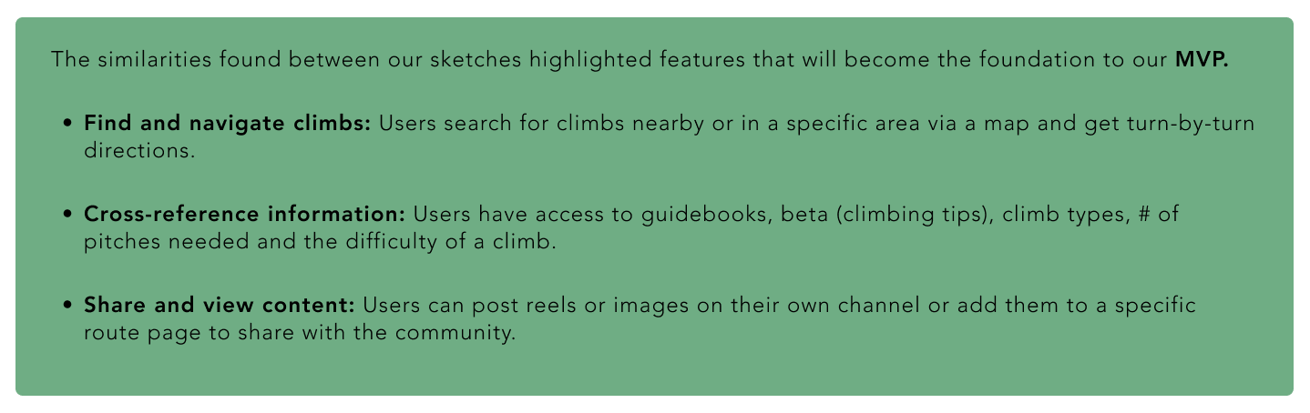
This is the landing page for the “Climb” category. This category’s primary function is supporting the user during every step of the rock climbing process by providing easy access to resources such as: navigation, news, gear check and accurate climbing information.

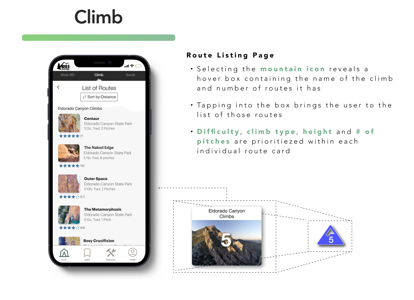
When searching for climbing routes via the map, a user will be brought to this Route Listing page arranged by distance, type or difficulty. Users can also utilize the Route Finder button for more specific search results.
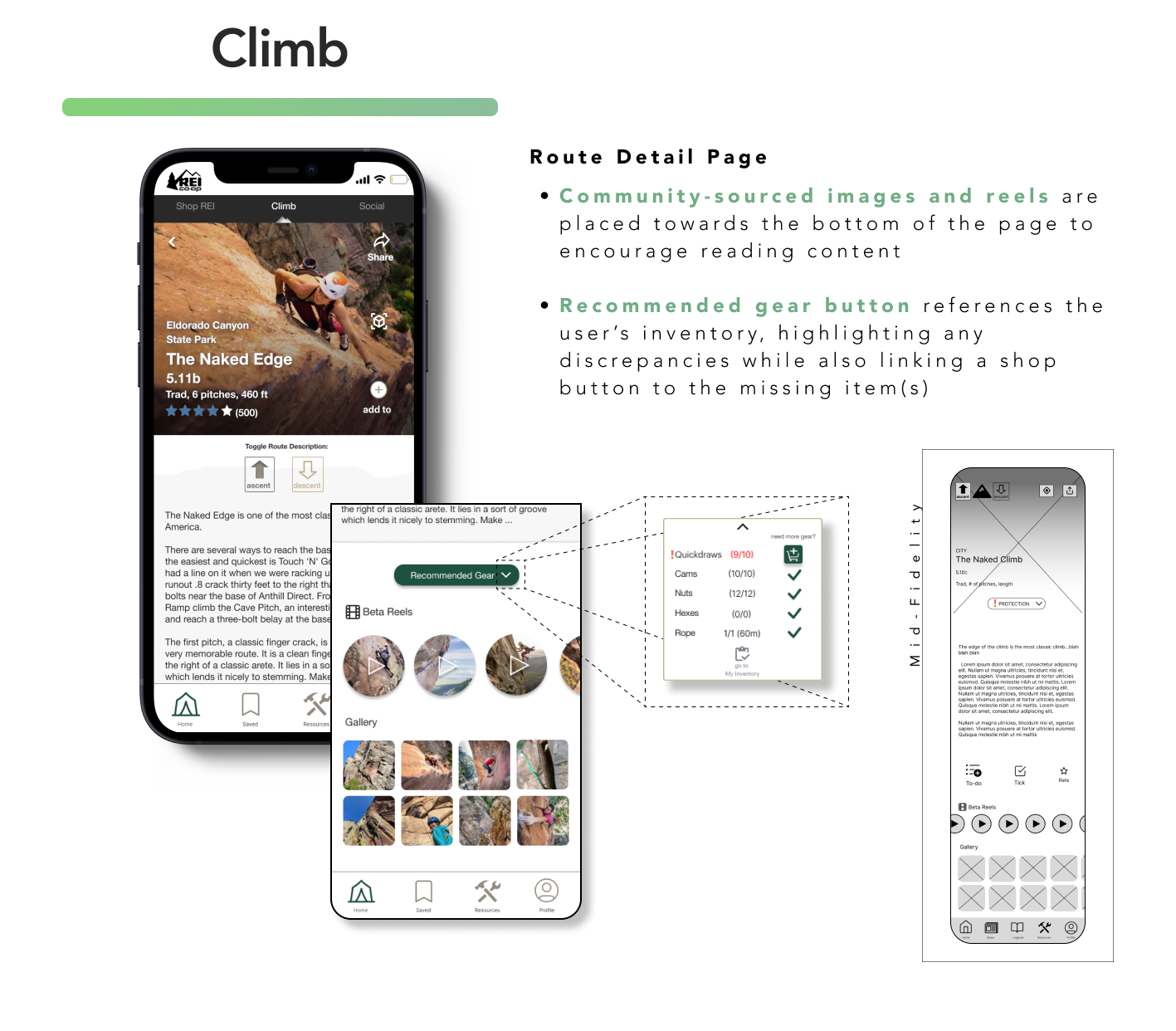
Users can see further details of a route and be able to read about how to climb the route, how to get back down, know what gear they’re missing and see images and reels. User will tap the “Climb” tab to bring them back to the map where they can begin navigating to the climb.
The “Shop REI” category is a streamlined version of REI’s current shopping app and only carries items related to rock climbing.

The “Social” category is where the community comes together to share their experiences.

Approach to Aesthetics
I used a minimal design that utilizes high contrast for emphasis and natural neutral colors. I took into account the possibility of low connectivity and little reception. Designing simpler would decrease loading times, remove any unwanted heaviness within the design and allow for a better functioning “off-line” feature.
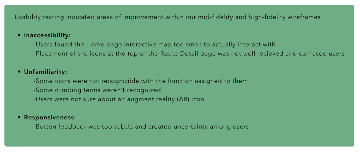
During our design studio, I sketched various landing pages for each of these categories: Shop, Climb, Social. I developed mid-fidelity wireframes which were the subject of our first round of usability testing, followed by a couple more rounds done on higher fidelity wireframes.
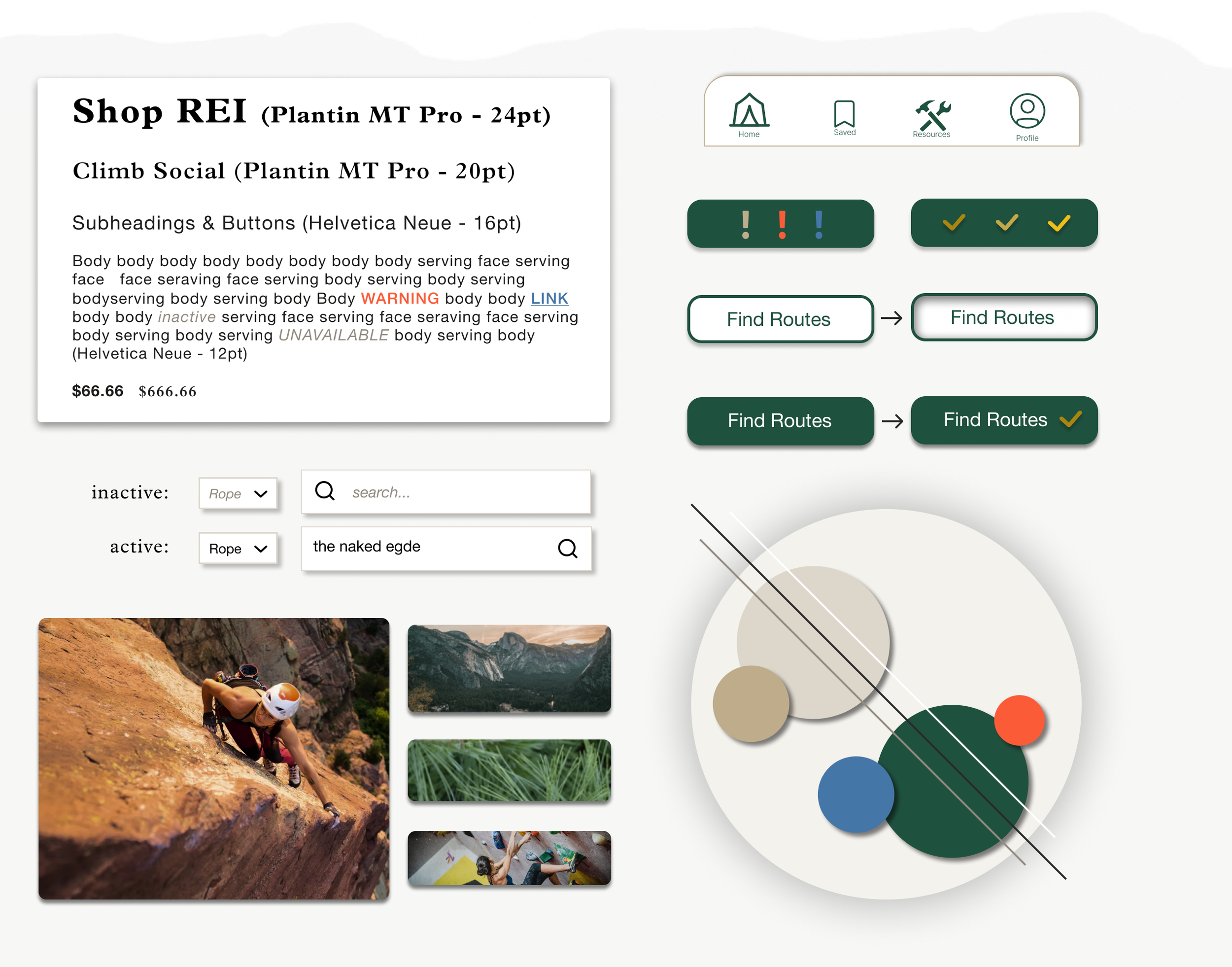
I built a style guide showing some general ideas for the typography, buttons and overall color story for the product.

Defining the “Climber”
My research findings pull from (9) user interviews, (19) survey participants and an analysis of both competitors and comparators. I aimed to discover and understand patterns of behavior, current pain-points, climbers needs and perspectives.
Here are some key interview quotes…
“I’ve definitely gotten lost looking for climbs.”
“A good description or picture of the start of a climb would be very helpful.”
“I use my phone during a climb to find where to go/route finding.”
Through affinity mapping, I compiled statements/quotes with similar topics to further our understanding of users needs and perspectives, as well as larger overarching themes.